
Selecting Fonts for Your Book
Selecting the correct fonts for your both the interior and covers of your book play a significant role in creating a book which is attractive and easily readable. Today’s desktop publishing software provides an overwhelming array of choices so we want to provide basic overview of choices and recommendations.

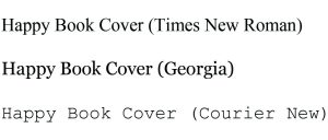
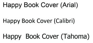
Typeface fonts can be broken down into two categories; serif and sans serif. Serif fonts have an extra stroke or little curve at the ends of characters. Since “sans” literally means “without, sans serif fonts do not include the extra strokes at the ends of letters.
Example Serif Fonts Example Sans Serif Fonts
Factor Genre When Selecting Fonts
Although there are not any established rules for dictating which fonts belong with each type of book, there are some expected norms for genres. Most importantly, you do not want distracting or conflicting fonts to diminish a reader’s enjoyment of your book. For most books, a font size between 10 and 12 is generally used for fiction and non-fiction printed books.
Basic recommendations for font selection:
- Fiction, memoirs, and (auto)biographies: A classic serif font that is easy to read is the safest choice. Garamond, Janson, and Bembo are some of our designers’ favorite choices.
- Nonfiction reference books and textbooks: There are active debates about which, serif or san serif, fonts look best for non-fiction books. One factor which should be considered is how the formatting styles (bold, italic, underline) appear. We want our clients’ books to be professional and hope that the font does distract. The following fonts should probably be avoided: One last piece of advice is to limit the number of fonts used throughout a book and try not to mix serif and san serif fonts on a cover. We constantly see examples of mismatched fonts and it normally distracts from a cover’s message.
- Children’s books: Font size and style need to match the tone and illustrations within your book, so there isn’t a set rule which font type to use. Typically, children’s book authors use fonts which a little more decorative and attention-grabbing.
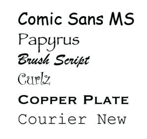
Fonts we don’t think fit for books
By selecting the right typeface, you will not only make your book easier to read but also look more professional. Our designers have experiences with all types of books and can provide assistance. Please contact us at 800-662-0701 x250.
Book Formatting
Professional Interior Book Formatting
250 Pages or Less
Print-ready layout is the most important key to a professional looking book. We refine your book to include the professional nuances of a high quality book formatting.
Services include:
- Correction of extra white spaces
- Paragraph indentations
- Mixed fonts
- Page numbering
- Page margins
- Page justifications
- Page headers/footers
- Chapter starts
- Copyright page
- Table of Contents
- Book gutter
- Proper order of front material and an updated Table of Contents
- Formatting does not correct typos, misspellings, incorrect wording, incorrect punctuation, or other editorial issues.

What to submit:
- Final proofread manuscript file.
- Microsoft Word files, separated by chapters.
- ISBN number (not required). This will appear on your copyright page.